Overview
2
Team Members
Core Designer, PM
5
Weeks
This project performed so well that we extended our initial contract to a total of 16 weeks and won our company a development contract for 2023.
As part of the extended contract, I was tasked to design 2 more parts of the platform’s subscription management and billing experiences.
Role
I was the lead UX designer for this project.
Design Tools
Figma, Fluent UI Design Library.
Result
An interactive mock-up of the platform’s North Star vision that’s ready for user testing and engineering.
Project Brief
The client is a leading tech company specializing in software sales and distribution. They offer a wide range of products, including subscriptions for low-code tools specifically designed for businesses. To provide a comprehensive solution, they have developed an admin center platform that allows businesses to effectively manage their tools and subscriptions, providing them with a high-level overview of their operations.
The client approached us wanting to improve one of the current admin platform's experiences that received a lot of negative feedback from users. Both my PM and I were tasked to re-invent the part of the platform that allows users to manage, track, and purchase their subscription storage.
*This project is under an NDA. Identifying information, data, naming, have been removed/altered.
A high-level view of the platform's user flow

Critiquing the current platform
I conducted a critique of the current platform as a first step. Overall, it provides unactionable insights and lacks helpful guides- leaving users frustrated with identifying their subscription usage, methods to increase it, or ways to reduce it.
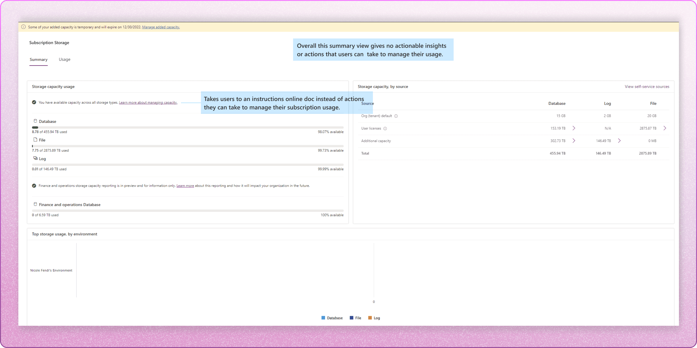
1 | Summary Page
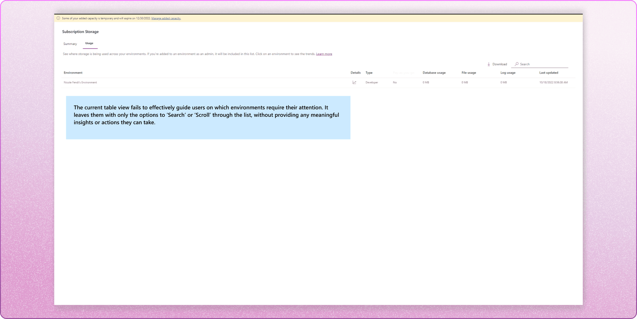
2 | List of environments
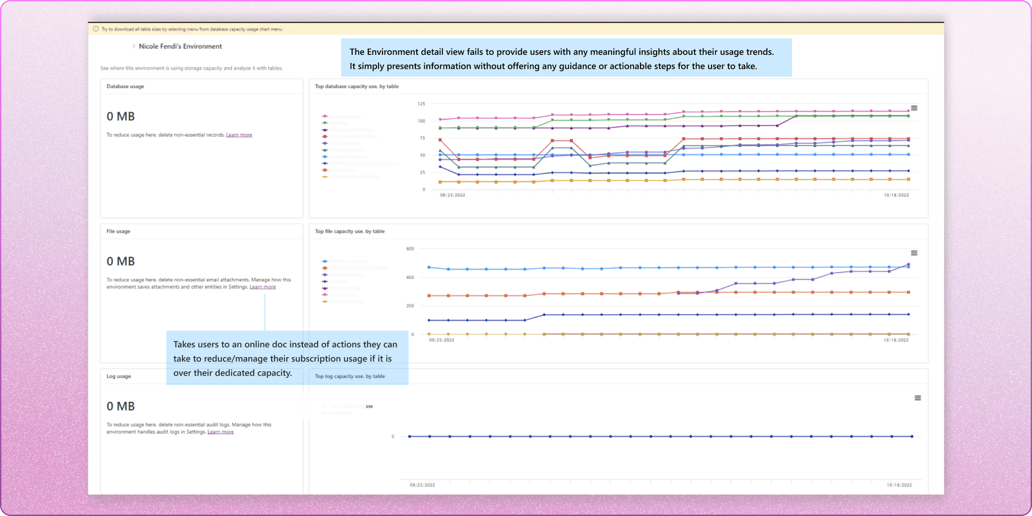
3 | Environment usage detailed view
What does the research say?
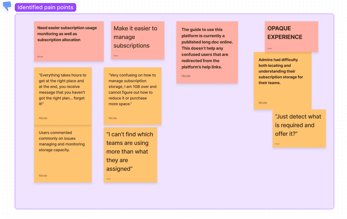
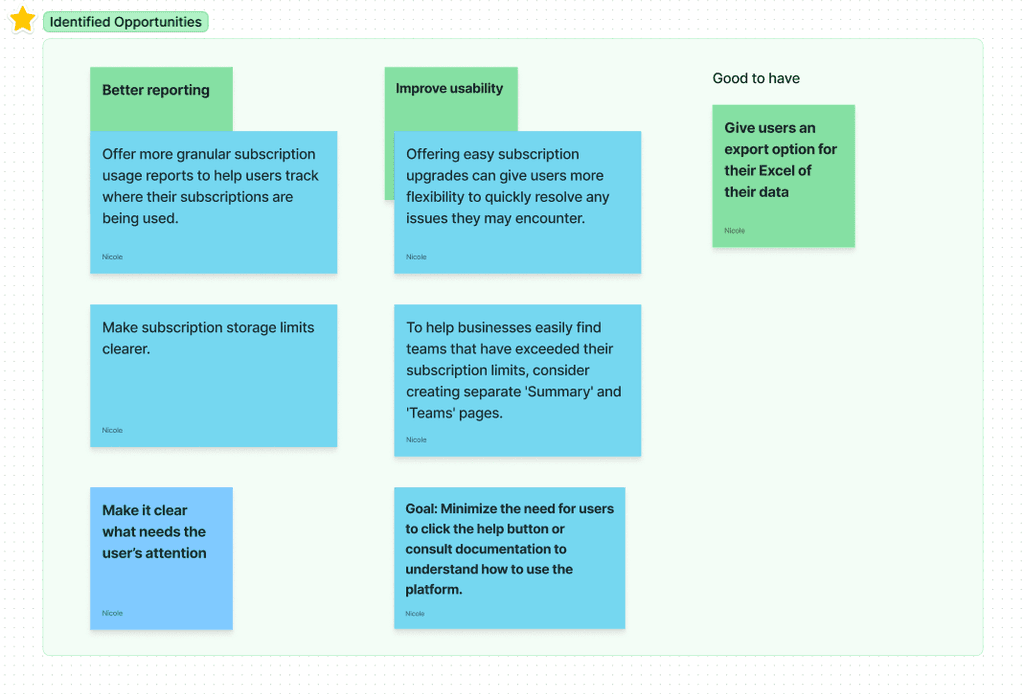
Thanks to our client's internal UX researcher, who conducted user testing and interviews on the previous platform, we gained valuable insights into the user's frustrations. During our sync sessions with the UX researcher, we actively discussed and identified particular pain points associated with the platform, as well as potential solutions aimed at enhancing its overall usability.
I started to map out and summarized these user insights into important pain points and actionable opportunities to guide our design decisions:
Design Explorations
It's time for the fun part 😉
1
How do we display usage?
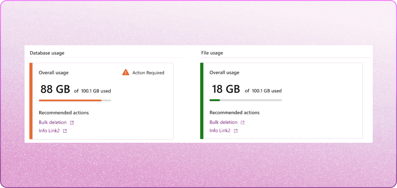
Pros: a warning is placed on a meter's card if it is in or near overage.
Cons: storage file level of data usage is too detailed for the summary view.
? What if there was a way to show usage per product?
2
A high-level view of environments
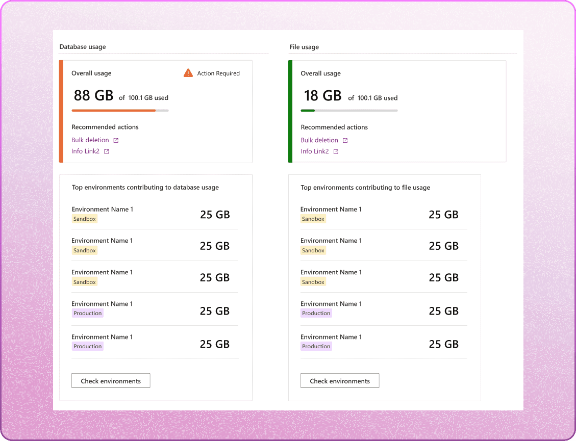
Pros: The labeled environments are categorized based on their types, and users are able to view the top contributing environments in a list.
Cons: this view only shows the top environments for each database file.
? Create an even higher-level view for the summary page that tells the users the overall health of their environments. It should be independent of a specific storage file and its associated product.
3
Adding recommended actions
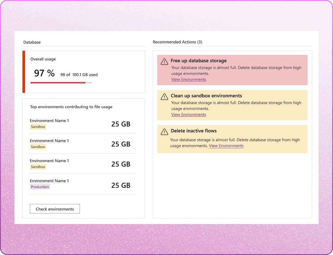
Pros: a highly effective way to let users know exactly what they need to do to take action on their storage.
Spoiler! Recommended actions successfully made it to the final design, but with better UI :)
4
Coming up with a general layout
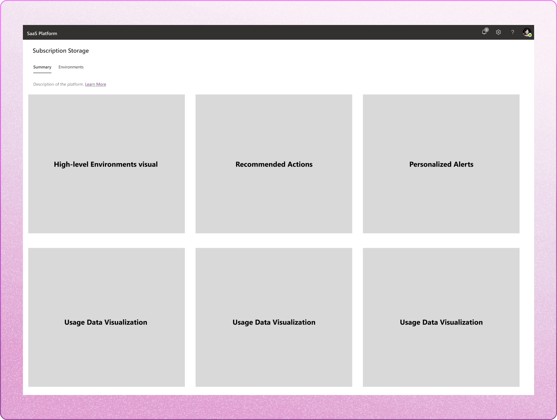
Plugging in the features into this new layout, to create a cohesive view.
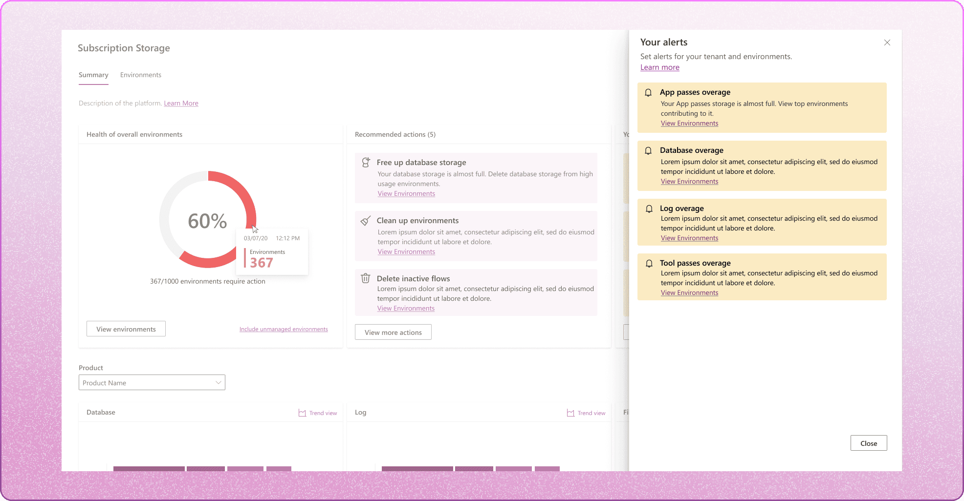
+Personalized alerts: users will be able to set overage limits to specific meters. If those limits are breached, those alerts will show up here on the Summary page.
5
Displaying environments as cards

Environment iteration 1: I started out with cards but realized quickly that they failed to encapsulate the data usage breakdown of each environment, and with the potential for a large number of customer environments (ranging from hundreds to thousands), they would occupy a considerable amount of display space.
The start of displaying more info for each environment
6

Environment iteration 2: my focus was on providing a more detailed breakdown of usage data. However, I found that using bars to display usage patterns might not be the most effective approach. So, I aimed to incorporate usage trends over time in the next iteration. In addition, I didn't want to show environments as cards again, similar to the first iteration-- it would still be a pain for users to scroll through hundreds or even thousands of them.
The big pivot!
7
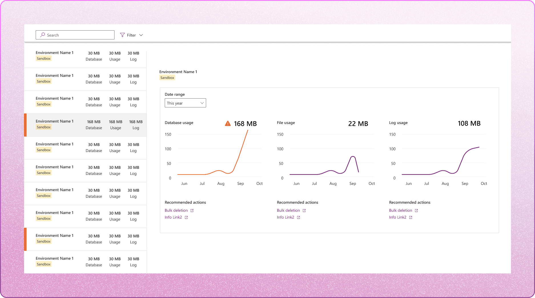
Environment iteration 3: I drew inspiration from a desktop messaging app pattern for this iteration. It offered the desired functionality of listing a good number of environments at once and displaying details when selected, which I wanted to emulate for the environments view. With this pattern, users can effortlessly scroll through multiple environments, click on their desired choice for more details, and view it on the large right-hand display.
Another reason why I stuck to this layout was users are able to evaluate usage over time which is important when analyzing common usage patterns and what action they take from that.
This iteration stuck through the final design, but it was still far from where I wanted it to be.
Putting it altogether 🥣
3 sprints, a handful of Figma frames, and a lot of coffee later...
The Final Design
SUMMARY PAGE
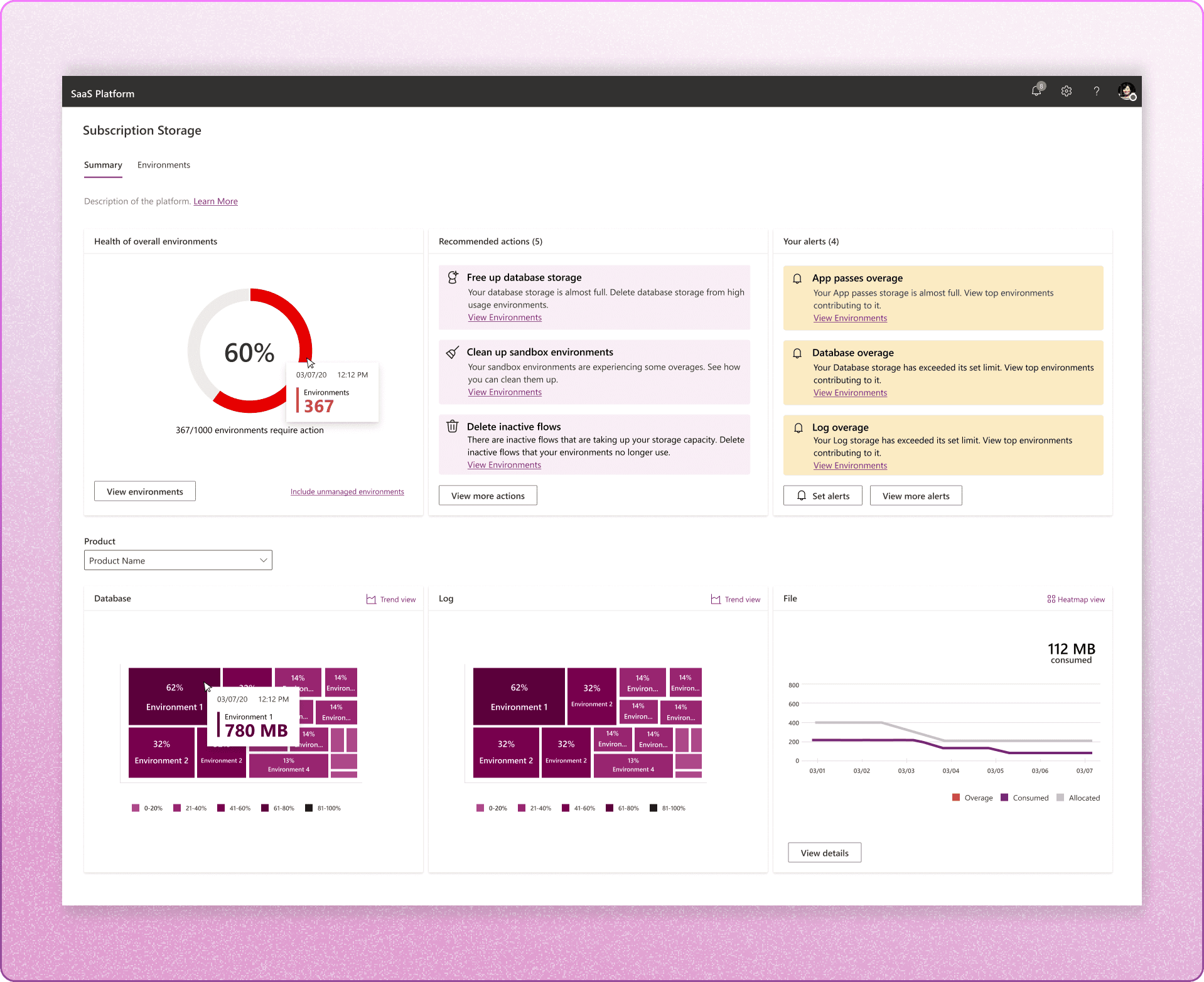
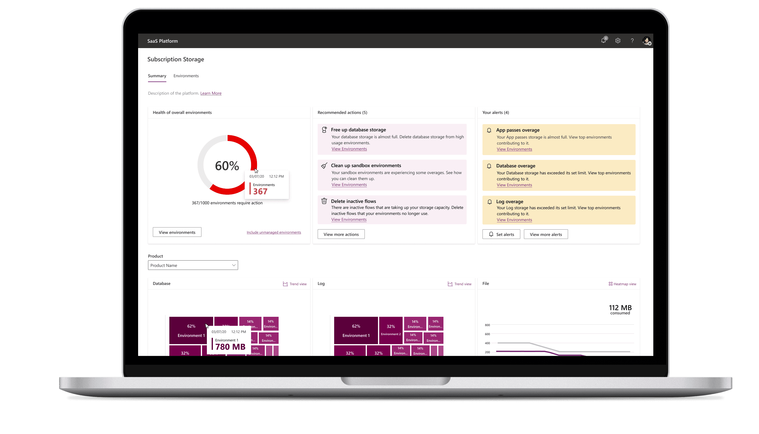
Giving users high-level visibility to their environments
Users are able to see the health of their overall environments with the help of the donut chart and will be able to access the environment page from the 'View environments' button. This will automatically filter the environment page with those environments that require attention.
They can drilldown to an environment's data insights by navigating to the environment tab.
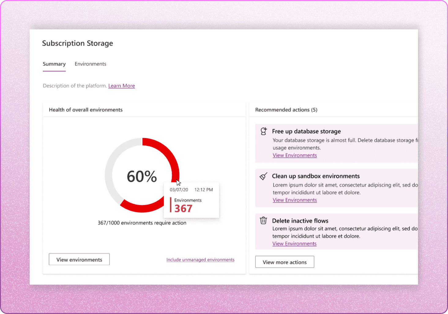

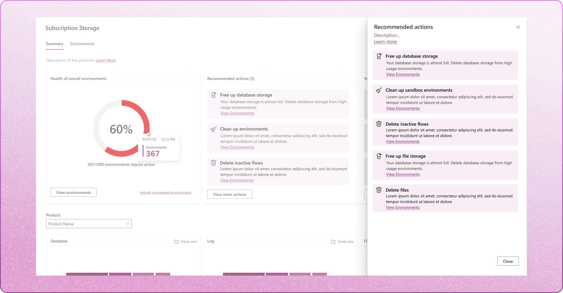
Provide users with clear recommended actions based on what's happening to their storage
One of the prominent user pain points were how unactionable the platform was. By providing 'Recommended actions', users can easily remove, allocate, and manage based on the information they are given hence, creating actionable insights.


Set personalized and automated alerts
Users are able to set limits for specific meters, and receive alerts if a meter goes over the limit they've set. This gives the user time to plan and manage their subscription storage before their meters go in overage.


See meters by product
The second half of the page allows users to narrow down to specific products and its usage components.
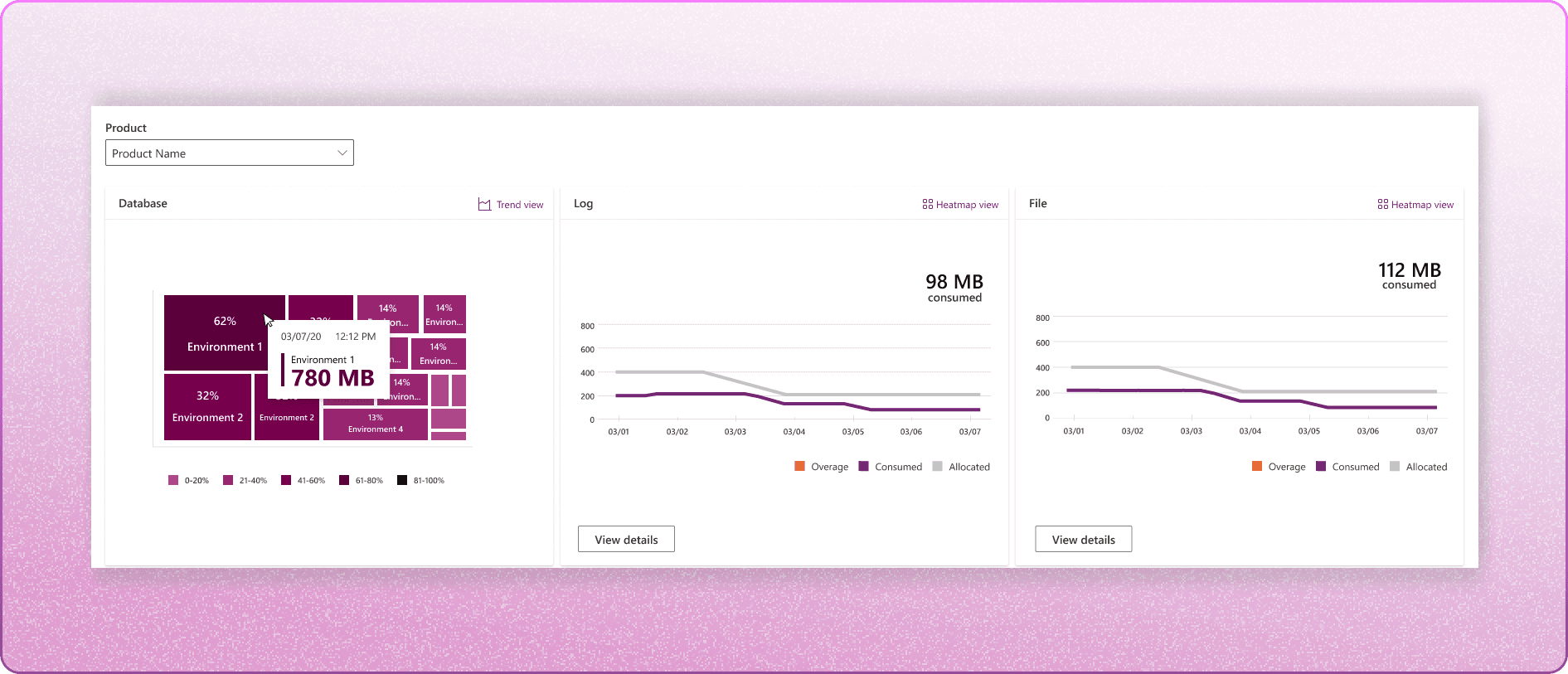


What is consuming the most space? And is there a pattern?
Users are able to set limits for specific meters, and receive alerts if a meter goes over the limit they've set. This gives the user time to plan and manage their subscription storage before their meters go in overage.


ENVIRONMENT PAGE
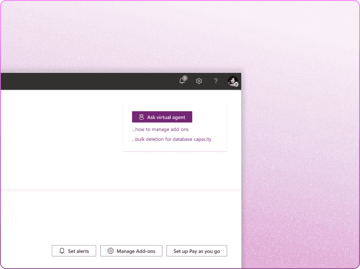
Let's call in a virtual agent!
Remember our goal of wanting to prevent the users from ever touching the help button?
So, I thought it would be cool if the users could just ask their questions based on what they see on their screens. We were able to bring in our client's virtual agent dev team to make it happen.
This virtual agent chatbot automatically grabs context from the user's screen to start a chat.

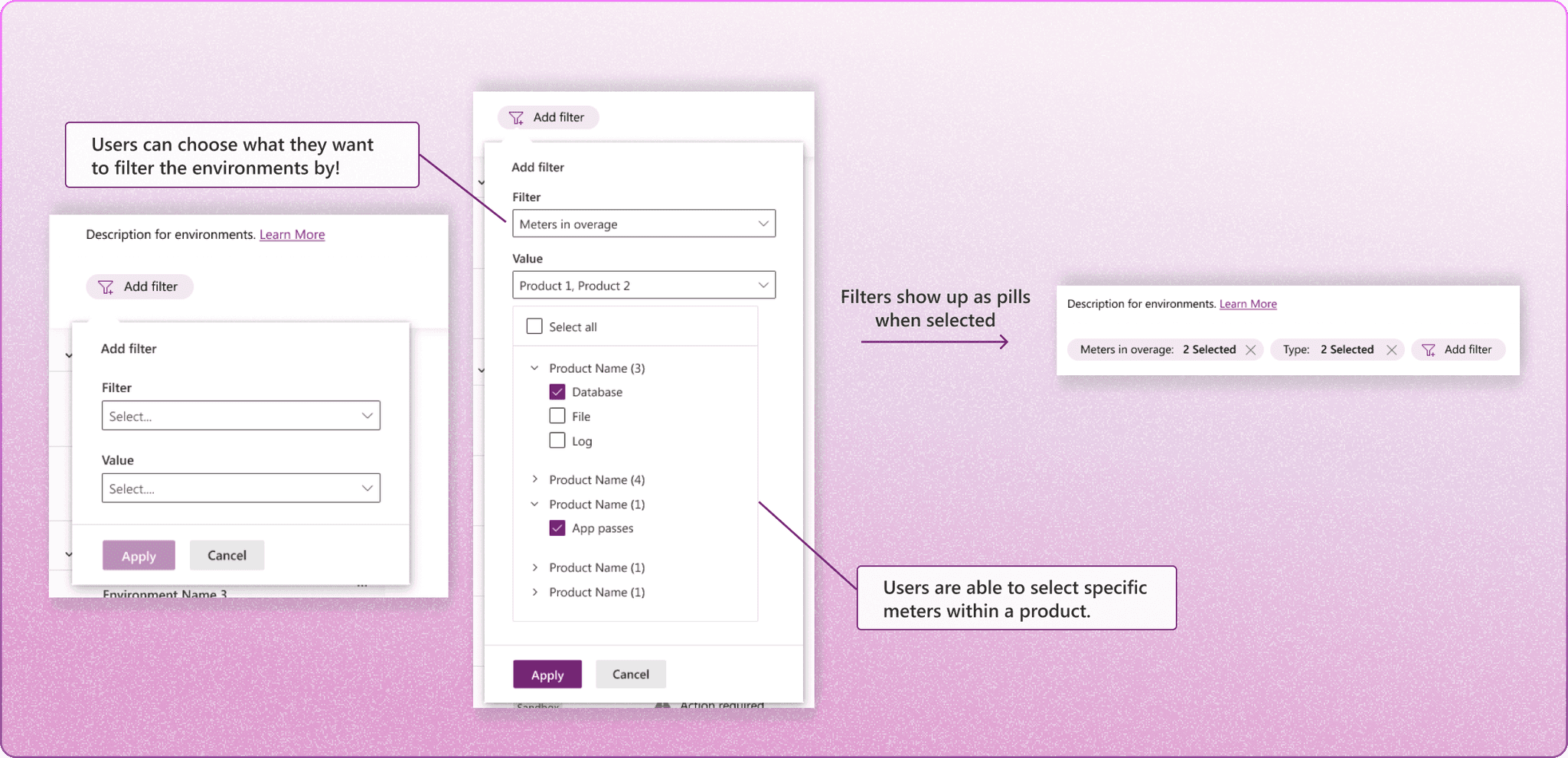
Filter through hundreds to thousands of environments
Users have the freedom to choose their own filters, such as 'meters in overage', 'environment types', or both. This system allows users to select specific meters within each product.


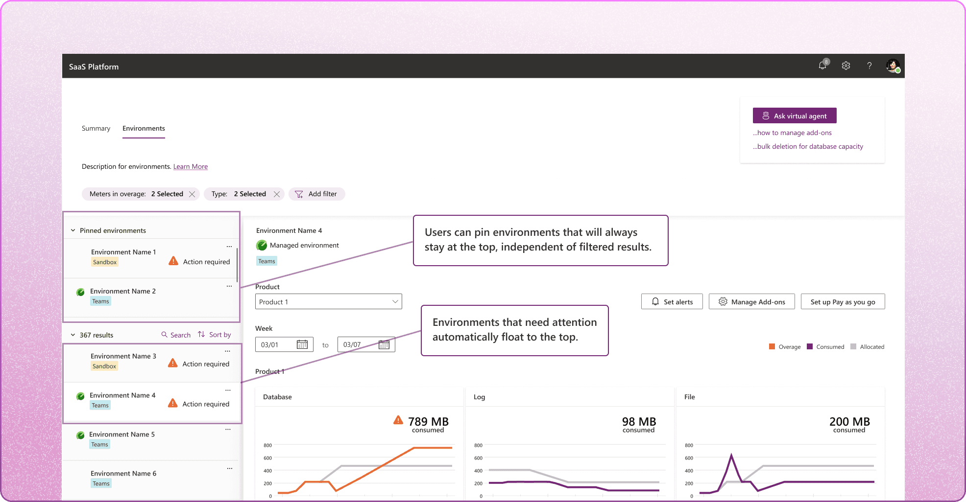
Optimized layout
Environments with meter overages float to the top of the list by default.
Plus, drawing more inspiration from a desktop messaging app, users are able to pin environments for easy access to frequently visited environments. Pinned environments will always show up at the top, unaffected by filter, sort, and search results.


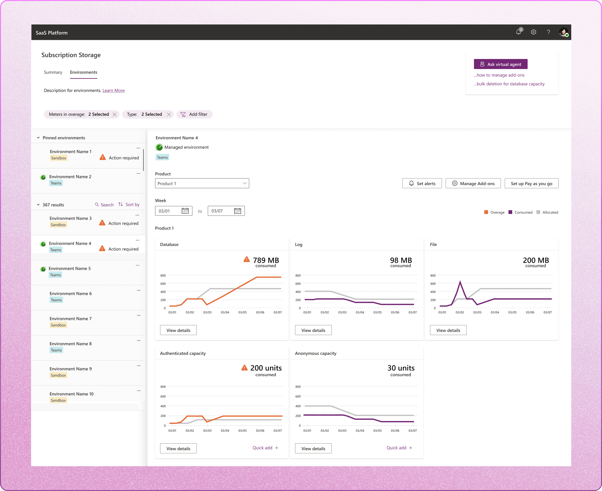
Revamped environment usage detailed view
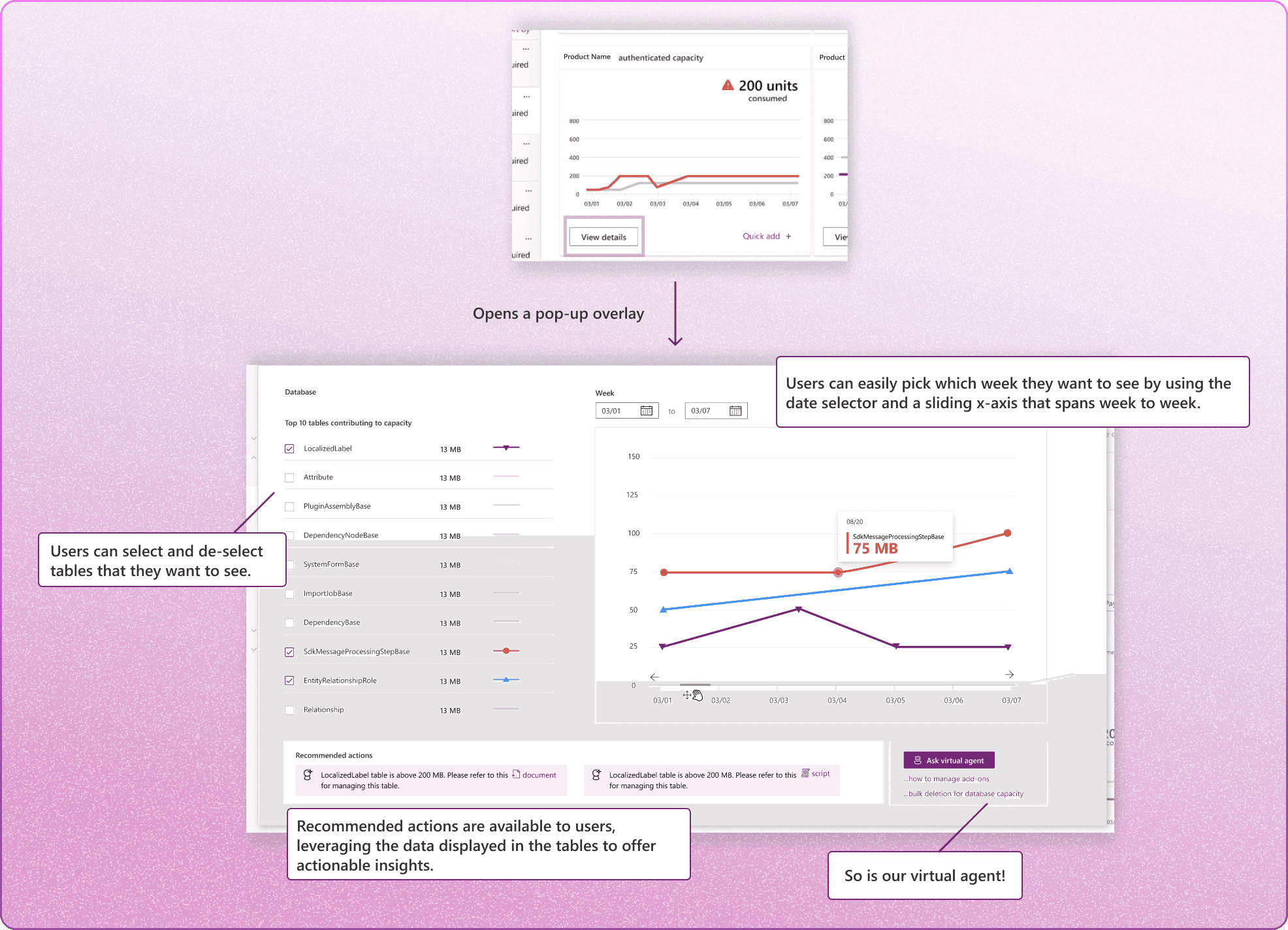
Recall back to the environment detailed page from the 'current platform critique' section that failed to provide users with meaningful and actionable insights-- I revamped it into a pop-up overlay that has the functionality to provide actionable insights and view customizability.

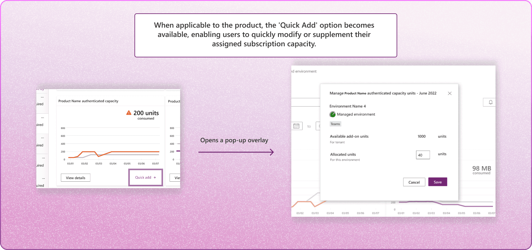
Quick Add: offering easy storage upgrades
Users are able to use 'Quick add' to allocate units from their 'available units' quickly when a meter goes in overage and that environment requires a quick solution.

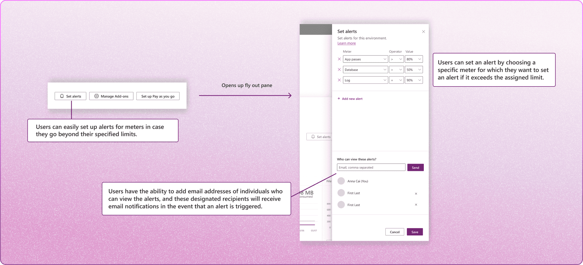
Setting alerts
Users are able to set up alerts for specific meters within an environment. These alerts are displayed in the 'Your alerts' section of the Summary page, and their visibility can be controlled based on invitation and admin status on the platform.


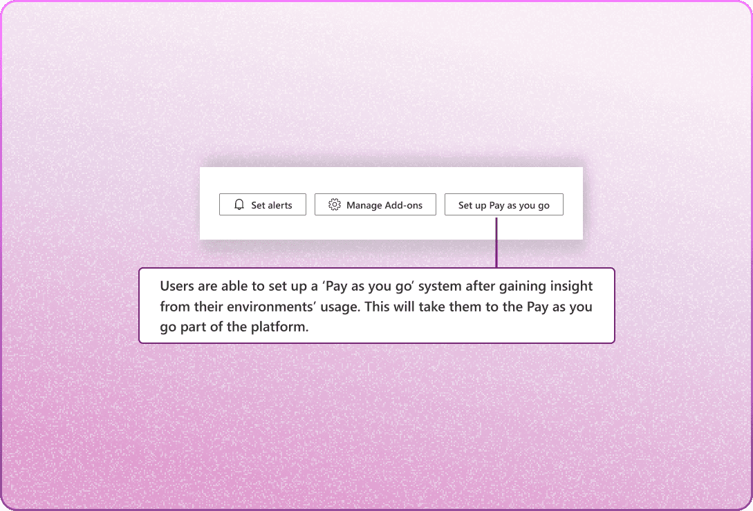
Pay as you go
We've added 'Pay as you go' to the platform as part of our extended project. Although not detailed in this case study, here's a quick overview!
Users can pay for their subscription based on actual usage with 'Pay as you go.' Charges are determined by resources or services consumed, offering a personalized and cost-efficient payment method.


Principal SWE Manager
"Really want to thank Nicole and Harshal (my wonderful PM) for the amazing work over the last few months. You guys have really helped us accelerate the UX dev."
Senior UX Designer
"It's been so great working with both of you! The designs you've come up with are very creative and offer a great experience!"
"
Quotes from my clients
